
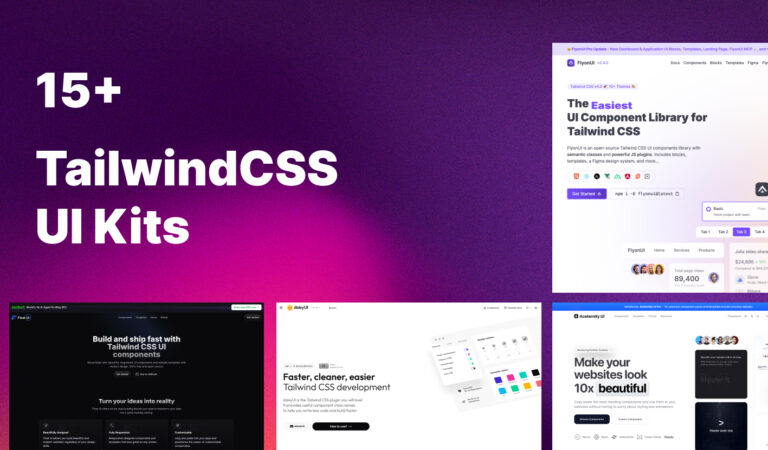
Free Tailwind CSS UI Kits: 15+ The Ultimate List of Tailwind UI Library
 7 months ago
Building beautiful, responsive user interfaces from scratch can be time-consuming and challenging. That’s where free Tailwind CSS UI kits come to the rescue. These comprehensive collections of pre-built components, blocks, and templates can dramatically speed up your development process while maintaining design consistency and quality.
In this comprehensive guide, we’ll explore the best free Tailwind CSS UI kits available in 2025, helping you choose the perfect toolkit for your next project.
What Are Free Tailwind CSS UI Kits?
Free Tailwind CSS UI kits are collections of pre-designed, reusable components built using Tailwind’s utility-first CSS framework. These kits typically include:
- UI Components: Buttons, forms, modals, cards, and navigation elements
- Layout Sections: Hero sections, pricing tables, testimonials, and footers
- Page Templates: Complete landing pages, dashboards, and application layouts
- Design Systems: Consistent styling patterns and color schemes
The beauty of these free UI kits lies in their flexibility – you get professional designs without the cost, and you can customize everything using Tailwind’s utility classes.
Why Choose Free Tailwind CSS UI Kits?
1. Accelerated Development
Instead of building components from scratch, you can copy and paste ready-made elements, reducing development time by 60-80%.
2. Professional Design Quality
These kits are created by experienced designers and developers, ensuring your projects look polished and modern.
3. Responsive by Default
All components are built with mobile-first principles, ensuring perfect display across all devices.
4. Easy Customization
Thanks to Tailwind’s utility-first approach, modifying colors, spacing, and layouts is straightforward.
5. Cost-Effective
Get premium-quality components without the premium price tag – perfect for startups and personal projects.
Top 16 Free Tailwind CSS UI Kits in 2025
Free Tailwind CSS UI Kits have revolutionized modern web development by providing developers with professionally designed, production-ready components at zero cost.
These comprehensive libraries eliminate the need to build common UI elements from scratch, dramatically reducing development time while maintaining high design standards. Whether you’re building a startup MVP, enterprise application, or personal project, these free resources offer the perfect balance of quality, flexibility, and accessibility that every developer needs.
FlyonUI
FlyonUI is the easiest, free and open-source Tailwind CSS UI components library with semantic classes. What sets FlyonUI apart is its unique combination of semantic styling with interactive JavaScript functionality, bridging the gap between design aesthetics and dynamic behavior.
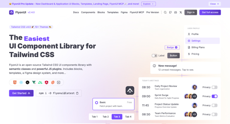
Components: 800+ free components and examples
Features: Semantic classes with headless JavaScript plugins, RTL support
Best For: Interactive applications requiring dynamic functionality
Key Highlights:
- 800+ Free Components & Examples for all your WebApp needs
- Interactive headless JavaScript plugins for accordion, dropdown, overlay functionality
- Universal Framework Compatibility: Fully compatible wherever Tailwind CSS is in action, from React to Vue and beyond
- Built-in support for third-party libraries like ApexCharts, FullCalendar, Flatpickr
- Responsive & RTL support with unlimited theming capabilities
- Clean, maintainable code with semantic class names
What Makes FlyonUI Special: FlyonUI brings together the beauty of semantic classes and the interactive headless JavaScript plugins, offering you a powerful toolkit to build stunning, interactive user interfaces with ease. Unlike other UI kits that focus purely on styling, FlyonUI addresses the common challenge of adding interactivity to Tailwind CSS projects without writing custom JavaScript.
View Flyon UI
Also Read – Tailwind CSS Landing Page Template
Aceternity UI
Aceternity UI stands out with its focus on animations and interactive elements, perfect for creating engaging user experiences.
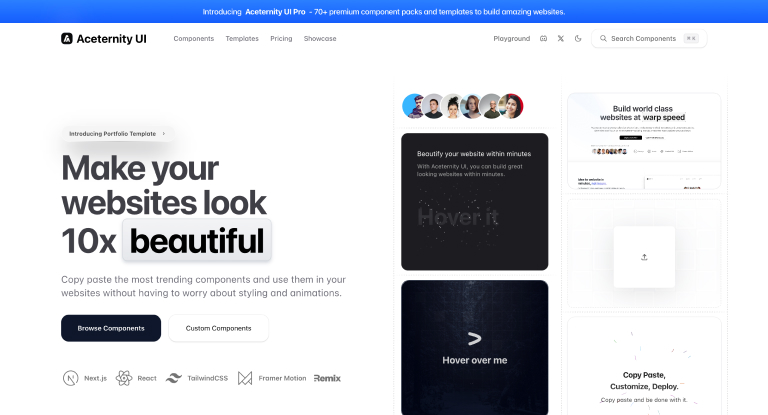
Components: 60+ animated components
Features: Built-in animations, modern styling
Best For: Interactive websites and portfolios
Key Highlights:
- Pre-built animations
- Modern aesthetic
- Interactive components
View Aceternity UI
DaisyUI
DaisyUI stands out as one of the most popular free Tailwind CSS UI kits. It provides semantic class names on top of Tailwind CSS, making it incredibly easy to build consistent UIs.
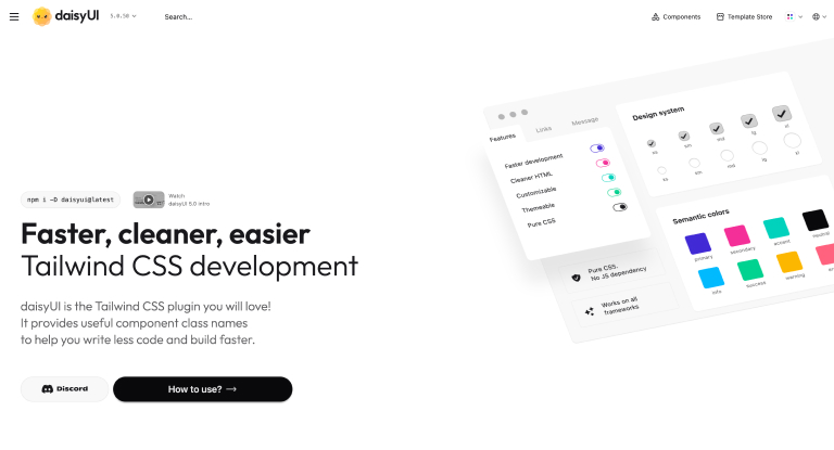
Components: 61+ pre-styled components
Features: 500+ utility classes, theme support, dark mode
Best For: Rapid prototyping and production applications
Key Highlights:
- Lightweight and highly flexible
- Compatible with most frameworks
- Extensive theme customization options
View DaisyUI
Headless UI
Created by the Tailwind CSS team, Headless UI focuses on functionality and accessibility while leaving styling entirely to you.
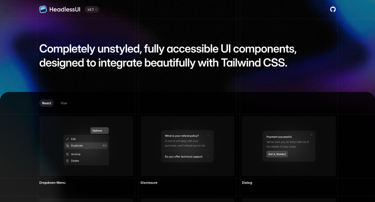
Components: 15+ functional components
Features: Full accessibility, unstyled components
Best For: Developers who want complete design control
Key Highlights:
- WAI-ARIA compliant components
- Available for React and Vue
- Perfect for custom design systems
View Headless UI
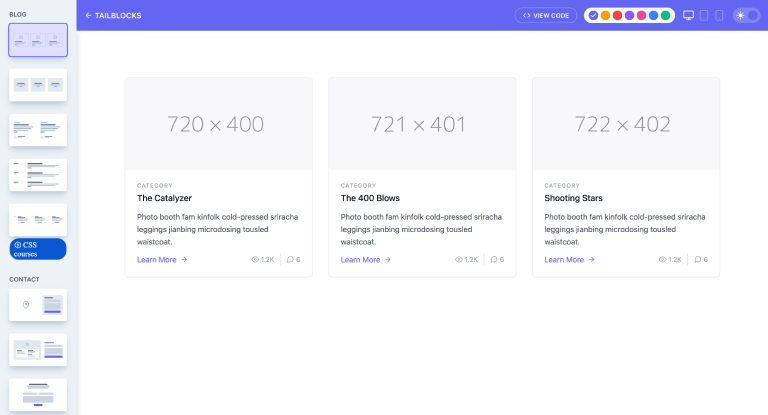
TailBlocks
TailBlocks offers a curated collection of ready-to-use page sections that you can mix and match to create complete websites.

Components: 60+ responsive blocks
Features: Dark mode support, multiple color schemes
Best For: Landing pages and marketing websites
Key Highlights:
- Easy copy-paste integration
- Multiple layout variations
- Great for quick website builds
View TailBlocks
Meraki UI
Meraki UI excels in providing beautiful, clean components with excellent support for right-to-left languages.
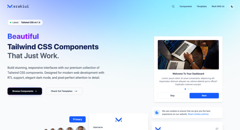
Components: 200+ clean components
Features: RTL support, dark mode, responsive design
Best For: International and multilingual applications
Key Highlights:
- Built with Flexbox and CSS Grid
- Comprehensive RTL support
- Elegant design aesthetics
View Meraki UI
HyperUI
HyperUI focuses on contemporary design patterns with smooth animations and interactions.
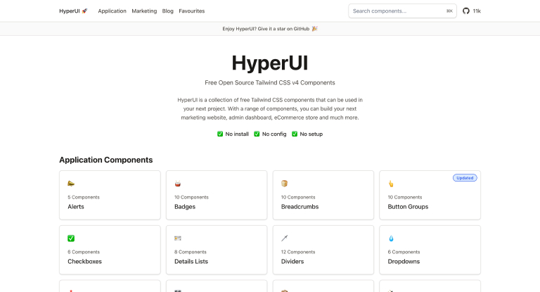
Components: 100+ modern components
Features: Tailwind CSS v4 compatible, dark mode
Best For: Modern web applications and dashboards
Key Highlights:
- Latest Tailwind CSS version support
- Modern design principles
- Easy customization
View Hyper UI
Flowbite
Flowbite offers one of the most comprehensive free component libraries with extensive framework support.
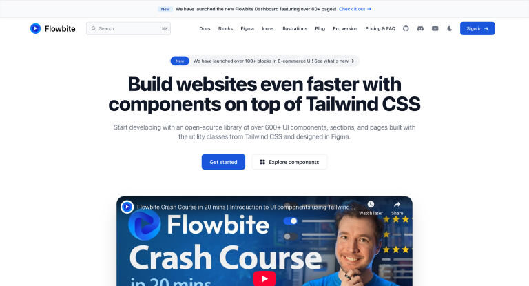
Components: 600+ interactive components
Features: Multi-framework support, Figma integration
Best For: Large-scale applications and design systems
Key Highlights:
- Supports React, Vue, Angular, and more
- Professional Figma design system
- Interactive JavaScript components
View Flowbite
Mamba UI
Mamba UI provides excellent variety with components organized into logical categories for easy discovery.
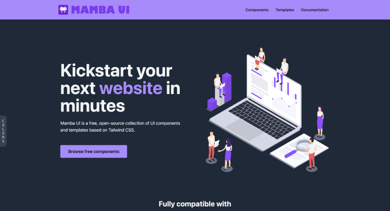
Key Highlights:
- Open-source and community-driven
- Multiple format support
- Comprehensive component coverage
View Mamba UI
TW Elements
TW Elements bridges the gap between Tailwind CSS and Material Design, offering the best of both worlds.
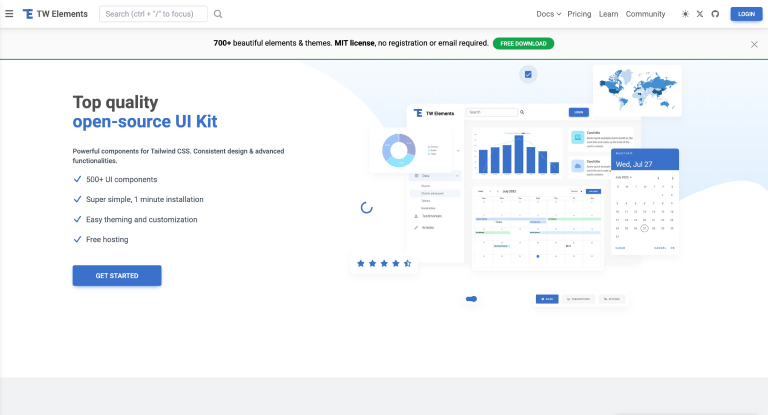
Components: 500+ Material Design components
Features: Material Design integration, multi-framework support
Best For: Material Design enthusiasts
Key Highlights:
- Material Design principles
- Extensive component library
- Framework flexibility
View TW Elements
Material Tailwind
Material Tailwind provides a comprehensive Material Design component library built specifically for Tailwind CSS.
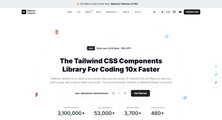
Components: 460+ Material Design components
Features: React and HTML support, theme customization
Best For: Modern applications with Material Design
Key Highlights:
- Authentic Material Design implementation
- MIT license for commercial use
- Clean code structure
View Material Tailwind
Float UI
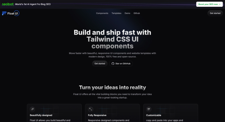
Float UI focuses on essential components with beautiful design and multiple framework support.
Components: 30+ responsive elements
Features: React, Vue, Svelte, HTML support
Best For: Landing pages and marketing sites
Key Highlights:
- Lightweight and optimized
- Modern design patterns
- Multi-framework compatibility
View Float UI
Wickedblocks
Wickedblocks specializes in marketing-focused components perfect for business websites and landing pages.
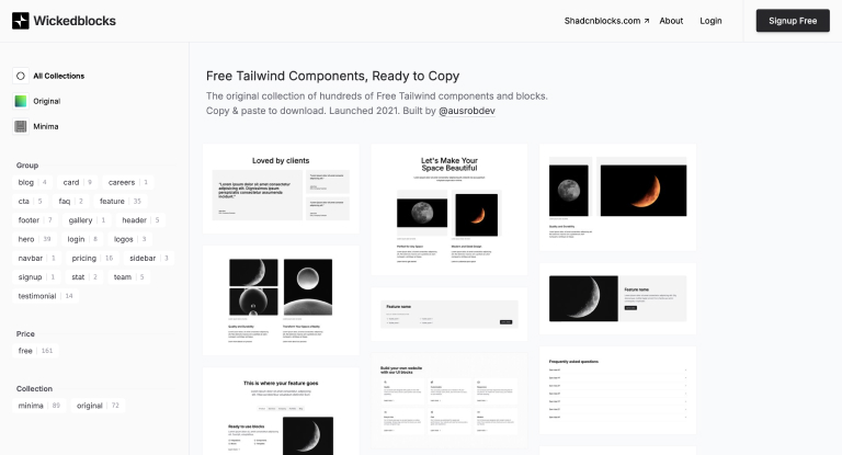
Components: 120+ UI blocks
Features: Tailwind CSS v3, fully responsive
Best For: Marketing pages and startup websites
Key Highlights:
- Marketing-optimized designs
- No setup required
- Copy-paste simplicity
View Wickedblocks
Tailkit
Tailkit offers extensive component coverage with support for multiple popular frameworks.
Components: 250+ components and templates
Features: React, Vue, Angular compatibility
Best For: Multi-framework projects
Key Highlights:
- Large component library
- Framework flexibility
- Commercial project friendly
View Tailkit
Ripple UI
Ripple UI emphasizes performance and efficiency while maintaining modern design standards.
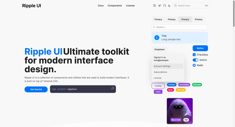
Components: 35+ reusable components
Features: Performance optimized, HTML and JSX support
Best For: Performance-critical applications
Key Highlights:
- Performance-focused design
- Minimal bundle size
- Clean implementation
View Ripple UI
Sailboat UI
Sailboat UI provides enterprise-ready components with focus on scalability and maintainability.
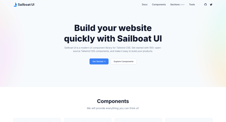
Components: 150+ modern components
Features: Open-source, scalable architecture
Best For: SaaS applications and dashboards
Key Highlights:
- Scalable component architecture
- Professional design quality
- Open-source community
View Sailboat UI
How to Choose the Right Free Tailwind CSS UI Kit
Consider Your Project Requirements
For Interactive Applications with JavaScript Functionality:
- FlyonUI, Flowbite, Aceternity UI
For Landing Pages and Marketing Sites:
- TailBlocks, Wickedblocks, Float UI
For Web Applications and Dashboards:
- DaisyUI, HyperUI, Sailboat UI
For Material Design Projects:
- Material Tailwind, TW Elements
For Custom Design Systems:
- Headless UI, Flowbite
Evaluate Framework Compatibility
Ensure the UI kit supports your preferred framework:
- React: Headless UI, Material Tailwind, Float UI
- Vue: DaisyUI, Meraki UI, Mamba UI
- Multi-framework: Flowbite, Tailkit, TW Elements
Assess Component Coverage
Different projects need different components:
- Basic Projects: TailBlocks, Ripple UI
- Comprehensive Needs: Flowbite, TW Elements
Specialized Requirements: Meraki UI (RTL), Aceternity UI (animations)
Frequently Asked Questions (FAQ)
Are free Tailwind CSS UI kits really free for commercial use?
Yes, most free Tailwind CSS UI kits are genuinely free for commercial use. However, always check the specific license:
– MIT License: DaisyUI, Material Tailwind, Headless UI – completely free for personal and commercial use
– Open Source: Most kits listed are open-source with permissive licenses
– Attribution: Some may require attribution in your project credits
– Always verify: Check each kit’s GitHub repository or official website for license details
Which free Tailwind UI kit is best for beginners?
For beginners, we recommend starting with:
– DaisyUI: Easiest to learn with semantic class names like btn, card, modal
– TailBlocks: Simple copy-paste sections perfect for learning
– Headless UI: If you want to learn Tailwind CSS fundamentals while getting accessible components
Can I mix components from different UI kits in the same project?
Yes, but with caution:
– CSS Conflicts: Different kits may have conflicting styles
– Design Consistency: Mixing too many kits can create inconsistent user experiences
– Bundle Size: Each additional kit increases your project size
– Best Practice: Choose one primary kit and supplement sparingly with specific components from others
Do these UI kits work with React, Vue, Angular, and other frameworks?
Framework compatibility varies by kit:
– Universal: DaisyUI, TailBlocks, Meraki UI work with any framework
– React-Specific: Headless UI, Material Tailwind have React versions
– Multi-Framework: Flowbite, TW Elements support multiple frameworks
– Framework-Agnostic: Most HTML-based kits work everywhere
How do I customize the colors and themes in these UI kits?
Customization methods depend on the kit:
– Tailwind Config: Modify tailwind.config.js to change global colors and spacing
– CSS Custom Properties: Many kits use CSS variables for easy theme switching
– Kit-Specific: DaisyUI uses themes, Flowbite has built-in customization options
– Utility Classes: Override with Tailwind utilities like bg-red-500 instead of default colors
How do I optimize the bundle size when using UI kits?
Follow these optimization strategies:
– Purge Unused CSS: Configure Tailwind’s purge/content options properly
– Import Selectively: Only import components you actually use
– Tree Shaking: Use build tools that support tree shaking
– Monitor Bundle Size: Use tools like Bundle Analyzer to track size impact
– Remove Unused Kits: Don’t load multiple kits if you’re only using one
Conclusion
Free Tailwind CSS UI kits represent an incredible opportunity for developers to build beautiful, professional interfaces without the overhead of designing from scratch. Whether you’re building a simple landing page or a complex web application, there’s a free UI kit that can accelerate your development process.
The key is choosing the right kit for your specific needs, understanding its strengths and limitations, and implementing it thoughtfully within your project architecture. With the comprehensive list and guidance provided in this article, you’re well-equipped to make an informed decision and start building amazing user interfaces today.
Remember, the best UI kit is the one that aligns with your project requirements, team expertise, and long-term maintenance goals. Start with one of the popular options like DaisyUI or Headless UI, experiment with different approaches, and find your perfect development workflow.
Happy building!